Publication Design — Graphic Designer
Woman’s World Magazine — 2016
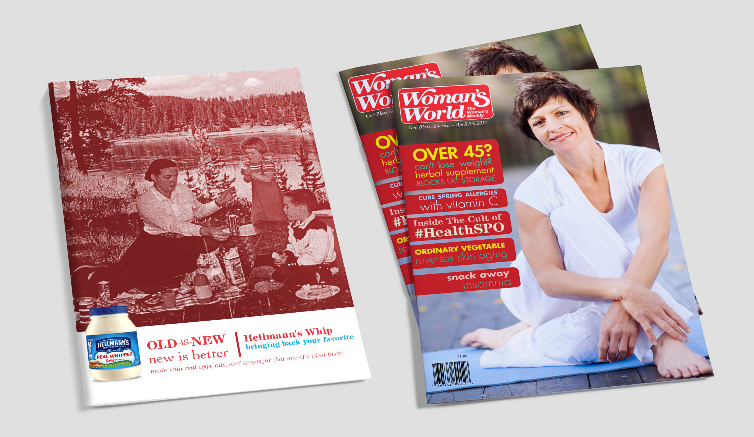
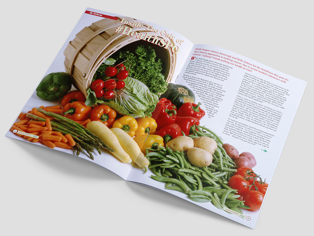
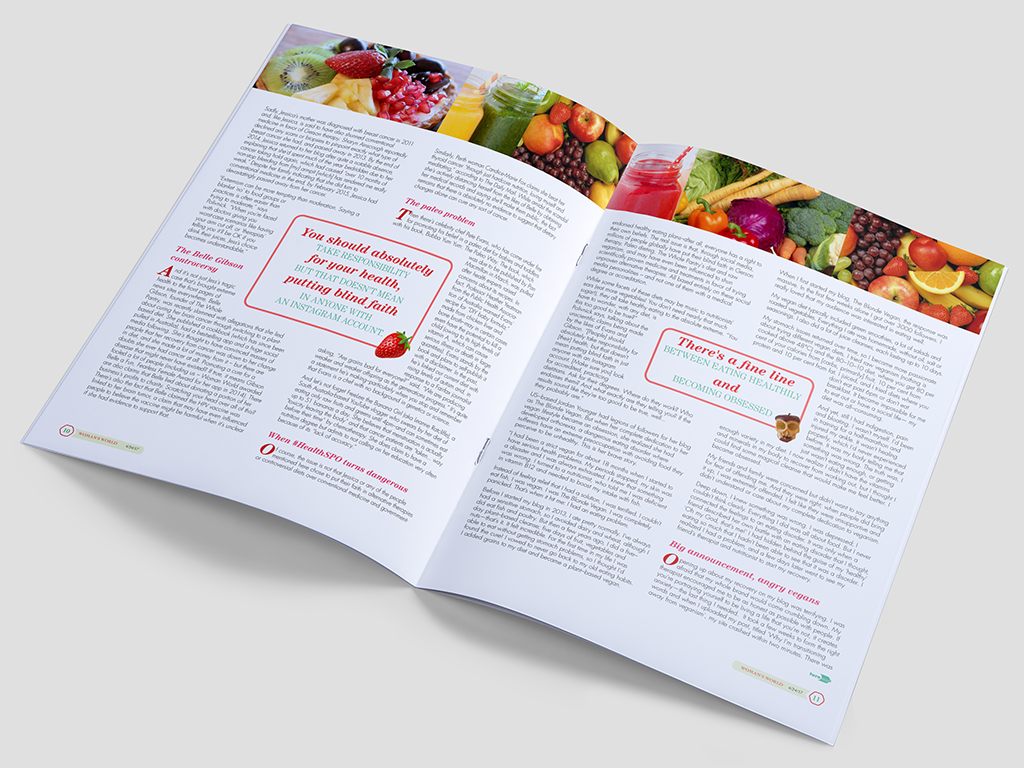
Maintaining Legacy with a Fresh Look — Woman’s World Magazine has been a staple on magazine racks for years. However, its information density often made it visually overwhelming compared to its competitors. Recognizing this opportunity, I embarked on a redesign project focused on streamlining content and enhancing visual appeal.
-
- woman-world-magazine-redesign-before-after-spread (4)
-
- woman-world-magazine-redesign-before-after-spread
-
- woman-world-magazine-redesign-before-after-spread (3)
-
- woman-world-magazine-redesign-before-after-spread (2)
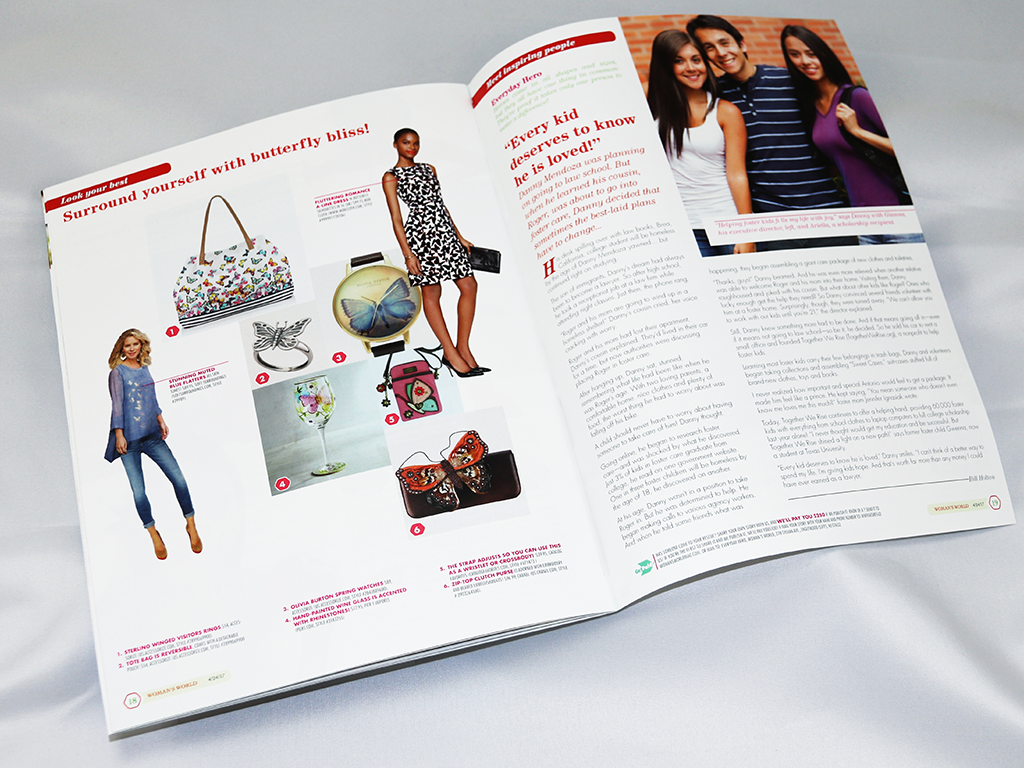
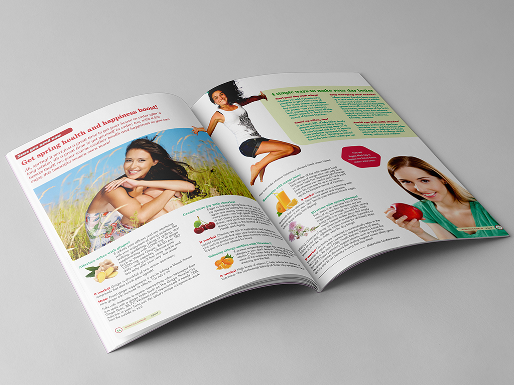

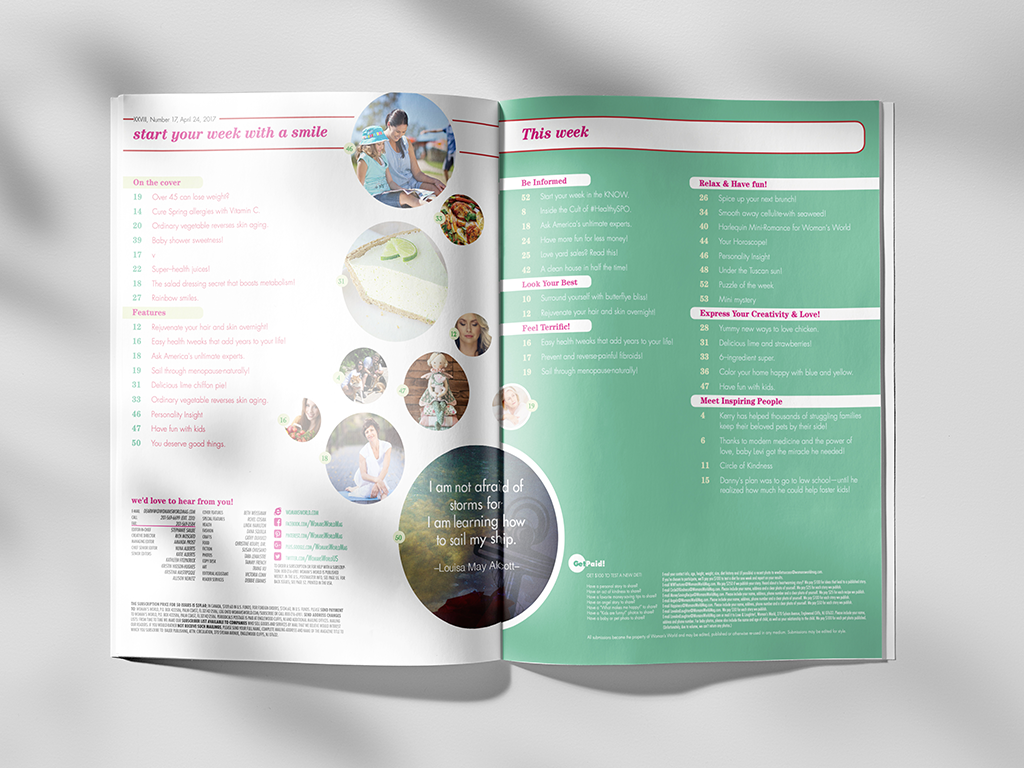
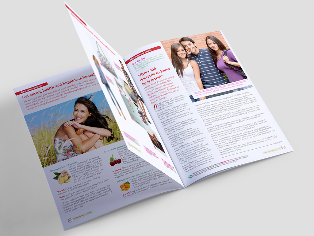
This project revitalized Woman’s World magazine, a supermarket checkout staple. I streamlined content, prioritizing high-impact articles, and implemented a minimalist design using clean lines and strategic typography. The focus was on improving readability and visual appeal while maintaining familiarity for long-time readers.
Strategic Content Curation: Reducing the page count from 28 to 16 required carefully selecting the most impactful and engaging content.
Color Theory in Action: Utilizing a strategic color palette played a crucial role in creating a visually cohesive and appealing magazine layout.
Balancing Information & Design: I honed my skills in managing information hierarchy, ensuring clear readability while maintaining an aesthetically pleasing layout.
Expanded Composition: The redesign explored adding more pages strategically, maintaining visual flow and reader engagement.